MOC: my Cafe Corner and Market Street
4 posters
Page 1 of 1
 MOC: my Cafe Corner and Market Street
i have decided to MOC the first 2 modulars. there is no way in hell im going to pay ~$2500 for MISB versions, the cost per brick is a waste of money. So, i have decided to hit my warchest of bricks and get into making them myself. i DL'd the instructions from lego.com as PDF's.
before the obvious is stated i will tell you now what i have changed:
1. they will not be the same colours. Market St is red, and Cafe Corner will be a different colour as well. i have tweaked a little bit of each to my liking, and brick availability.
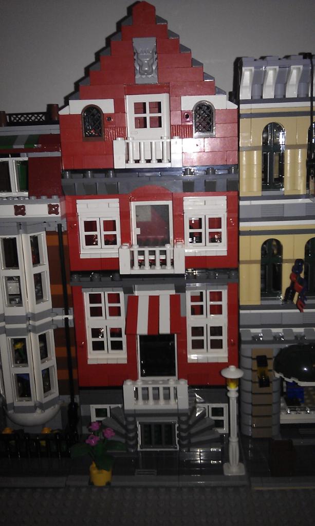
so here is Market St:
-balconies were changed to square
-red instead of blue
-no side part of the build, just the house
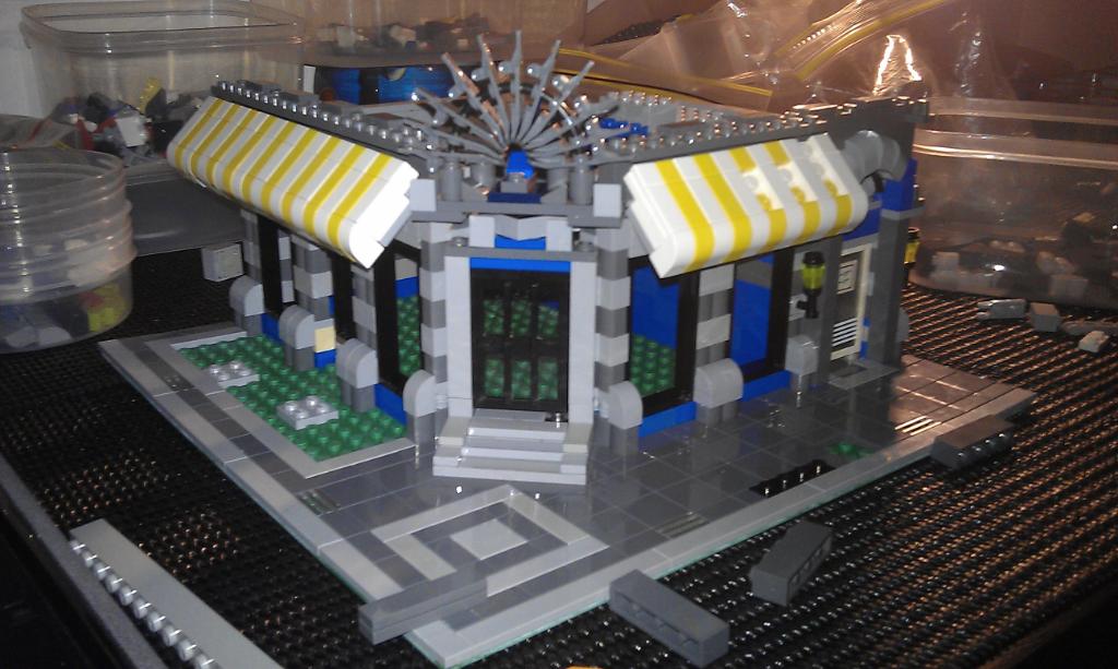
CC is still a work in progress. i have almost finished the ground floor, i need to do another Parts run at Toy corner soon...
- using standard blue bricks instead of the rare and pricey dark blue
- changed the roof part of the ground floor to dark bley, instead of white/light bley.
- the fan above the door is dark bley instead of white
im not going for complete colour replication. im sure they will look great still being a little different. at the moment these 2 have hammered my parts stash (but when i think about it, this is why i have the stash in the first place), i reckon i might be able to squeeze another 2 modulars out of the guts of my collection.
before the obvious is stated i will tell you now what i have changed:
1. they will not be the same colours. Market St is red, and Cafe Corner will be a different colour as well. i have tweaked a little bit of each to my liking, and brick availability.
so here is Market St:
-balconies were changed to square
-red instead of blue
-no side part of the build, just the house

CC is still a work in progress. i have almost finished the ground floor, i need to do another Parts run at Toy corner soon...
- using standard blue bricks instead of the rare and pricey dark blue
- changed the roof part of the ground floor to dark bley, instead of white/light bley.
- the fan above the door is dark bley instead of white

im not going for complete colour replication. im sure they will look great still being a little different. at the moment these 2 have hammered my parts stash (but when i think about it, this is why i have the stash in the first place), i reckon i might be able to squeeze another 2 modulars out of the guts of my collection.

jigsaw- Vegemite Eater

- Number of posts : 239
Location : Adelaide
Registration date : 2012-05-17
 Re: MOC: my Cafe Corner and Market Street
Jigsaw,
I've done one with a red ground floor and dark bley upper levels which turned out really well. Are you going to keep the blue for each level?
I've done one with a red ground floor and dark bley upper levels which turned out really well. Are you going to keep the blue for each level?
 Re: MOC: my Cafe Corner and Market Street
Looking good, I don't have enough parts to make any of these. I need to buy some ebay bulk lots.
Ajax- Vegemite Eater

- Number of posts : 285
Location : QLD
Registration date : 2012-10-08
 Re: MOC: my Cafe Corner and Market Street
Xyver wrote:Jigsaw,
I've done one with a red ground floor and dark bley upper levels which turned out really well. Are you going to keep the blue for each level?
not sure yet. im probably going to have to go white/dark bley or something like that. the roof will be black like the pet shop.
top floor windows are going to be yellow! but, i have a plan to incorporate more yellow into the building to settle it down a bit.
the hotel sign.... well im thinking of changing that all together as well!
btw, bought town hall today too!

jigsaw- Vegemite Eater

- Number of posts : 239
Location : Adelaide
Registration date : 2012-05-17
 Re: MOC: my Cafe Corner and Market Street
I made my sign in red, with gold 1x1 rounds for the writing, it looks good.
My original attempt can be found here: MOD Cafe Corner and how it looks currently here in Naiaville - I've actually turned the top levels around as it is now waterfront and added a couple of extra awnings and surrounding decks.
My original attempt can be found here: MOD Cafe Corner and how it looks currently here in Naiaville - I've actually turned the top levels around as it is now waterfront and added a couple of extra awnings and surrounding decks.
 Re: MOC: my Cafe Corner and Market Street
i saw your CC last night! good work on it, love the propeller and the colour matches really well.
for the sign... i have something up my sleeve!
for the sign... i have something up my sleeve!

jigsaw- Vegemite Eater

- Number of posts : 239
Location : Adelaide
Registration date : 2012-05-17
 Re: MOC: my Cafe Corner and Market Street
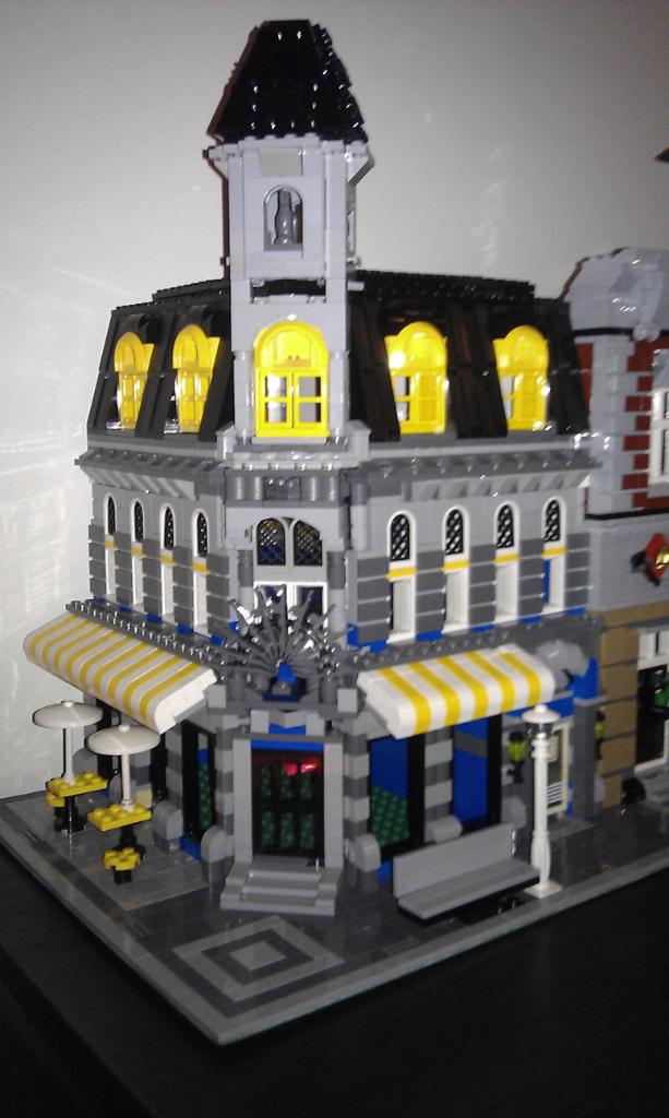
finished! a $1500+ MISB built myself for about $150 in extra parts out of my own stash


jigsaw- Vegemite Eater

- Number of posts : 239
Location : Adelaide
Registration date : 2012-05-17
 Re: MOC: my Cafe Corner and Market Street
Looks good jigsaw, great work.
Those top windows are very bright, I can't decide whether they work or not.
Those top windows are very bright, I can't decide whether they work or not.
 Re: MOC: my Cafe Corner and Market Street
Xyver wrote:Looks good jigsaw, great work.
Those top windows are very bright, I can't decide whether they work or not.
sadly i had a choice between red and yellow window frames only. im not 100% on it either, but it's a case of making do with resources


jigsaw- Vegemite Eater

- Number of posts : 239
Location : Adelaide
Registration date : 2012-05-17
 Re: MOC: my Cafe Corner and Market Street
I like the grey and yellow in the structure.....Brick On 'JS' ! 


Lightningtiger- Kelly Gang Member

- Title : Town MOC builder genius !
Number of posts : 1668
Location : Adelaide
Registration date : 2009-10-30
 Similar topics
» City Corner MOD
» aresze's moc - Cafe
» Review - 3061 City Park Cafe
» Street fighter 4
» MOC - 1950's Street (2013)
» aresze's moc - Cafe
» Review - 3061 City Park Cafe
» Street fighter 4
» MOC - 1950's Street (2013)
Page 1 of 1
Permissions in this forum:
You cannot reply to topics in this forum


